


Creating A Safer Planet,
One Step At A Time.
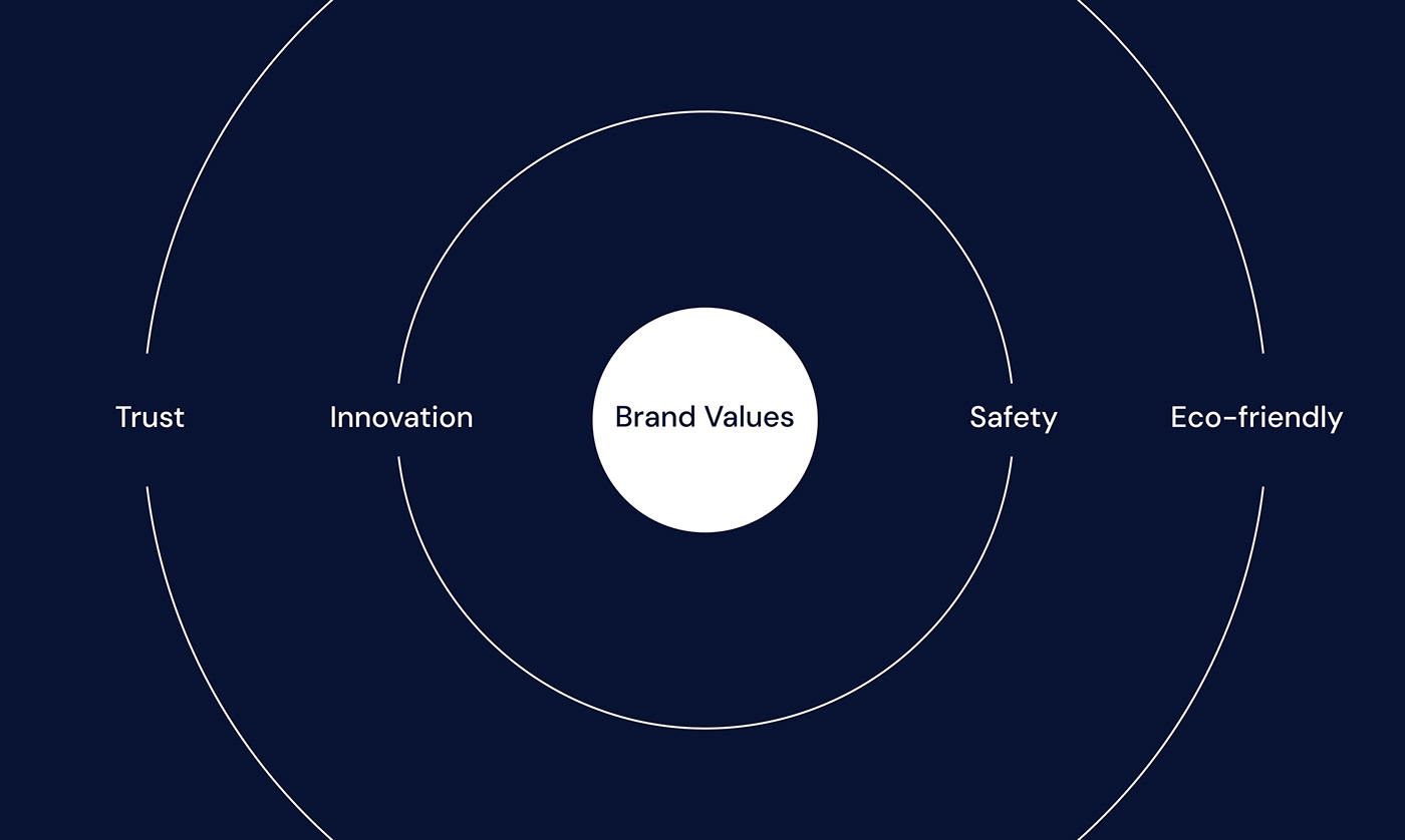
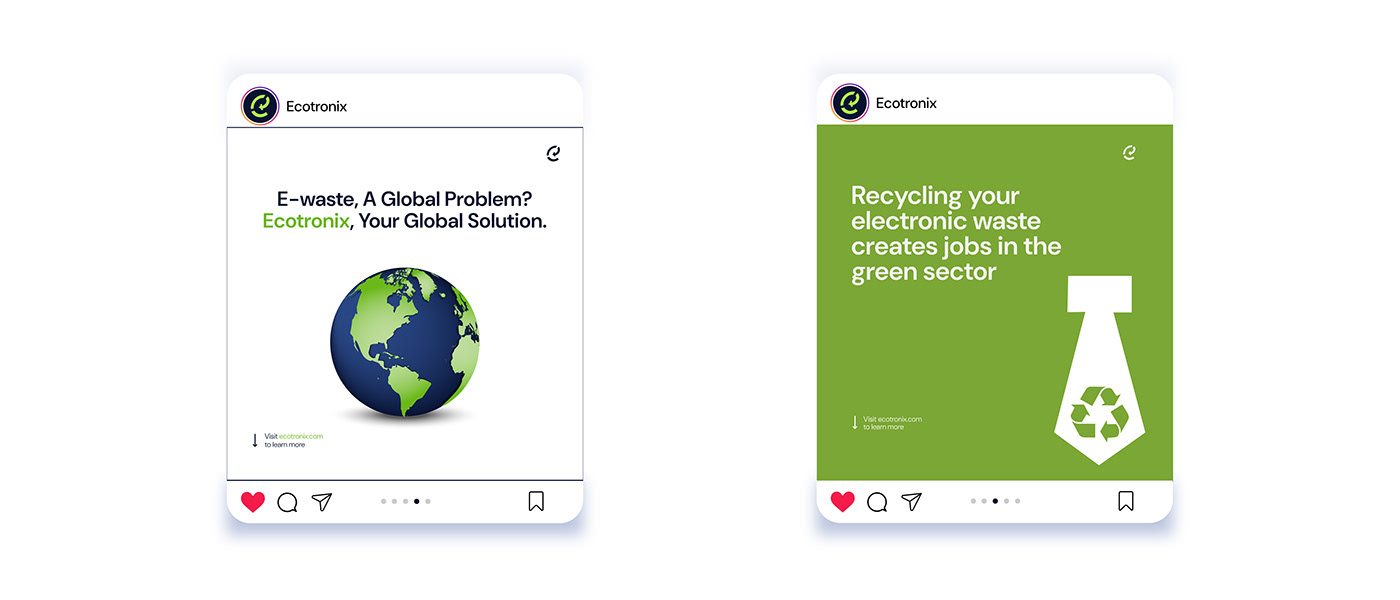
Ecotronix's vision lies in creating a safer planet for all humanity to thrive in. Their aim as an organization goes beyond recycling electronic waste, it includes convincing consumeers, governments and businesses that having the right attitude towards e-waste recycling creates a safer planet for us all to live in.
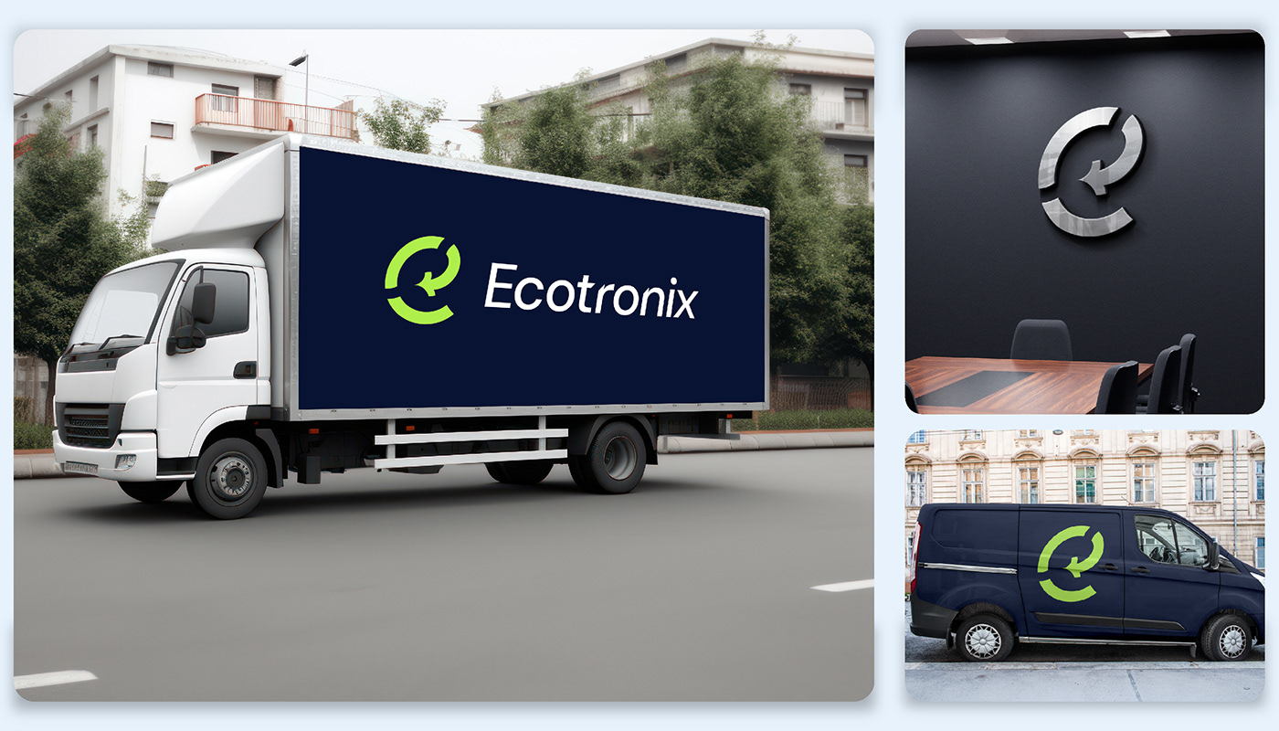
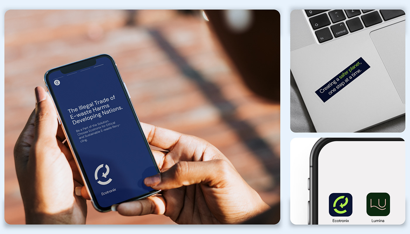
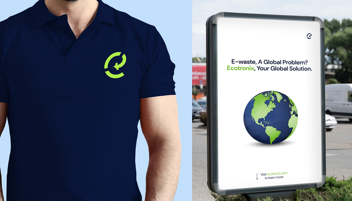
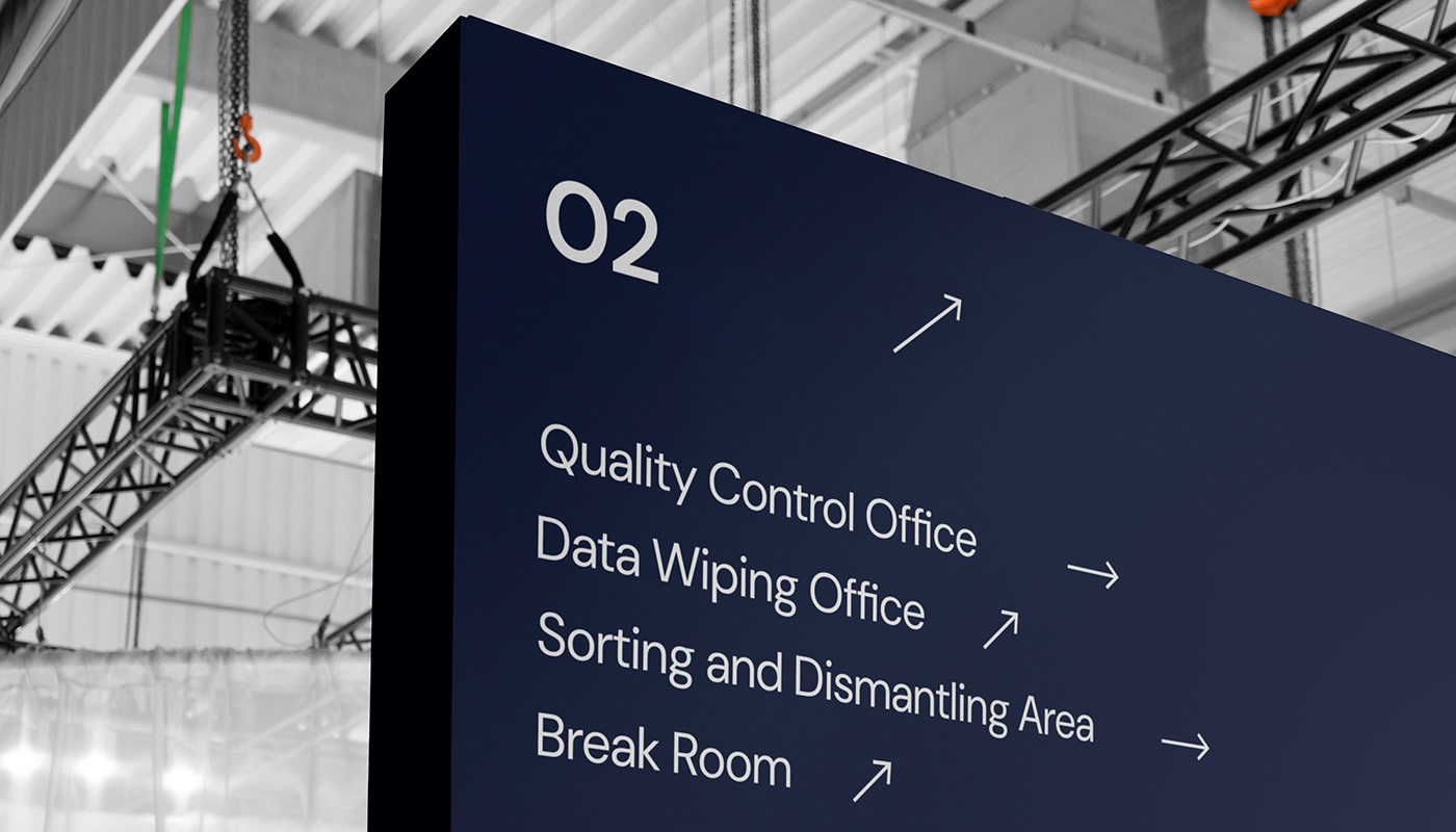
My role as the designer was for me to have a perfcet understanding of the brand, make research and come up with design solutions to accurately represent the brand visually and verbally. The logo itself is a visual representation of a circular ecosystem for electronic waste, something which Ecotronix is focused on. My job was to create a cohesive brand identity across multiple touchpoints for Ecotronix. The aim was to give the brand a thoroughly professional visual identity befitting for a global brand.
NB: This is a fictional project, it is just a means to showcase the level of my abilities.
Project Type
Brand Identity Design, Infographics
Designer
ADEBAJO Daniel
Date
April, 2024.
My Creative Logo Design Process
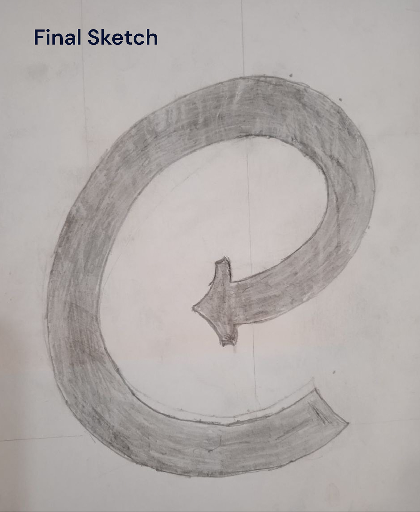
Having understood the core fundamentals of the brand, I worked on how I could visually represent certain personalities in a simple, unique and functional logo mark. I landed on some ideas initially but they were not good enough, hence I kept working.
After a while, I had the epiphany that the lower case letter "e" had a circular foundation, I figured I could use this to visually represent a circular ecosystem for electronic waste. With this understanding I kept sketching, and I landed on a solid idea. In my final sketch, I ensured the degree of the slant of the logomark is the same as that of the logotype, this is to ensure a seamless relationship between the logomark and logotype when used together. Some final refinements were made for more aesthetic appeal and functionality.


The Logo's Rationale
1) The logo is slanted to the right to subtly show the forward thinking mindset and innovative personality of the organization.
2) The arrow gives the idea that the logo is for a recycling organization.
3) Finally, the logo is broken into 3 parts to represent the brand's ethos, which is: Creating a safer planet, one step at a time. Each part represents a step in creating a safer planet, I also used this visual element in a clever way, as shown in later slides.


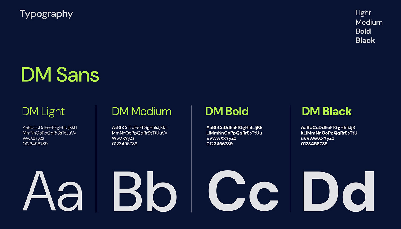
Logotype
The logotype is modified from the original typeface to add aesthetic appeal.


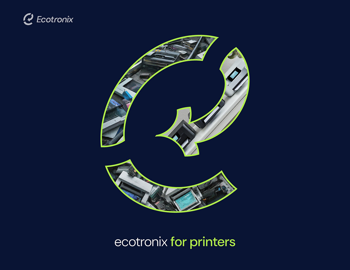
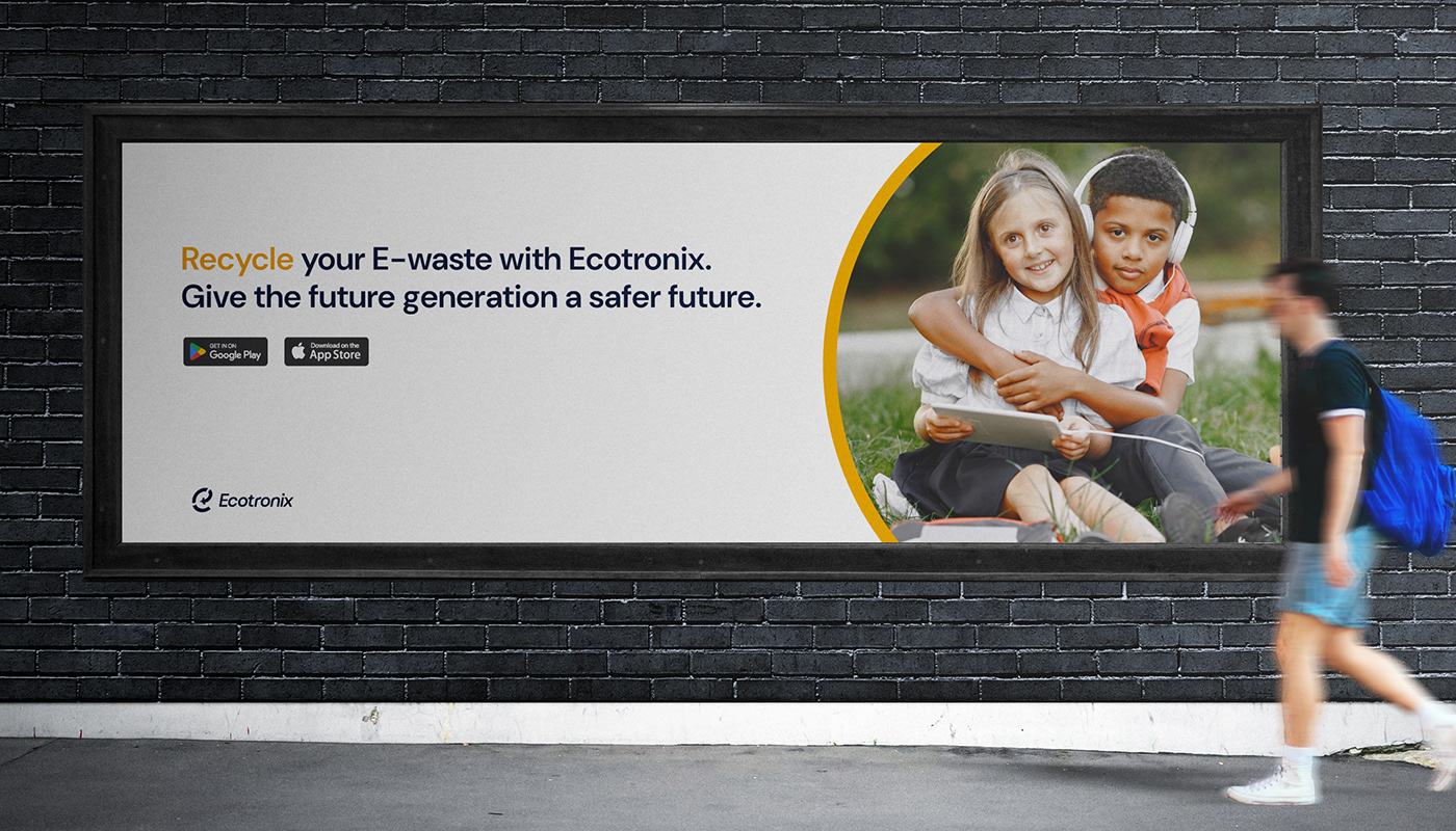
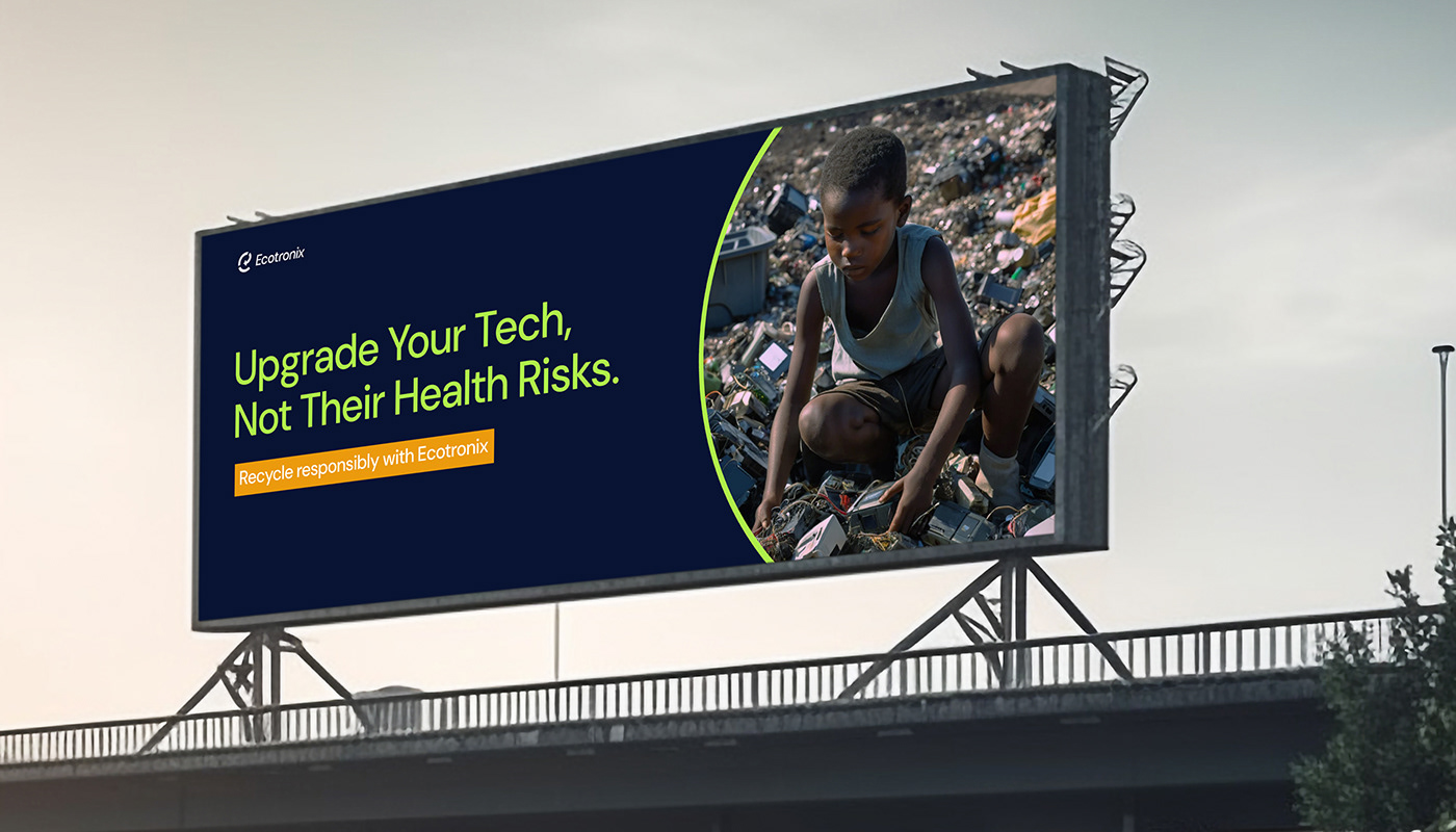
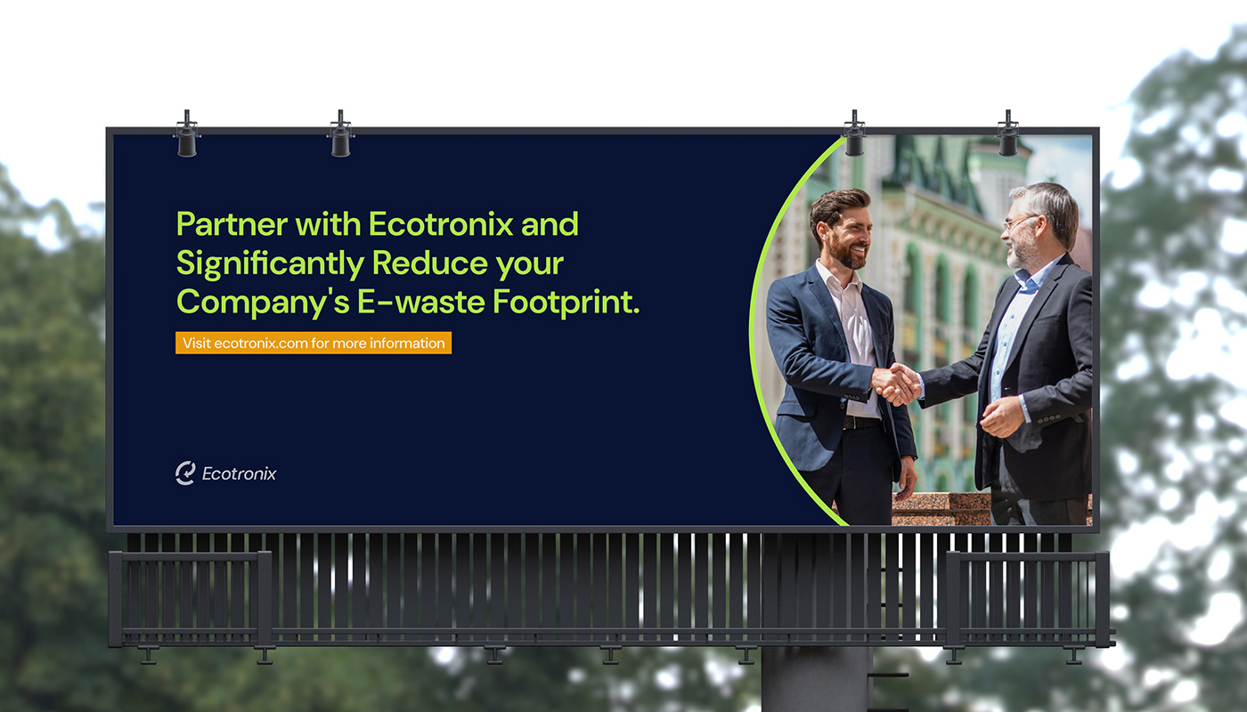
I made special ad campaigns for the organization using the logomark. Each ad focuses on electronic waste from a particular electronic device. I utilized the three parts of the logomark.
For example, in the ad for phones; the lowest part of the logo shows e-waste from phones, the next part shows e-waste from phones but on a conveyor belt(in a recycling facility) indicating the recycling process, the last part shows brand new phones which have been made in part from the resources gotten from the electronic waste. This campaign visually represents the circular ecosystem for electronic waste the organization is focused on, and will further build recognition in the minds of the target audience.
This campaign was done for computers, printers, and realistically, the organization can do it for as many different kinds of electronic waste as they want.


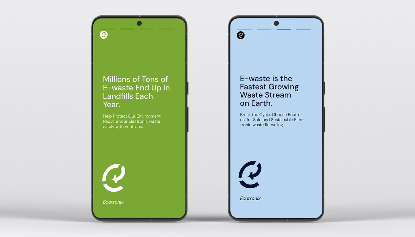


I made a flexible grid system for an an ad campaign for the organization. The logomark, logotype and ad copy were all placed in a cohesive and appealing manner.


During the course of working on this project, I got inspired by the works of certain designers, most of whom are Nigerians. They are: Fathiu Olayemi, Seun Adugbole, Oba Afolayan, Akinbinu Akintayo, Sofia Kononova, Hassan Oluwatobi, Mardiyah Alexandra Miller, Faith Samuel, Alex Tundun, Obasola Akintola.
They all are great designers, and you should check their works out.


I created Infographics for the organization showcasing their achievements in 2023, and also some general statistics in the Electronic Waste Industry.
I started by deciding which important data points to visualize, then I sketched to aid in designing and chose the best ways to visualize each data point to improve the visual appeal of the Infographic, and make it easy for the reader to absorb the information.


